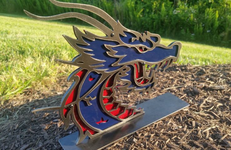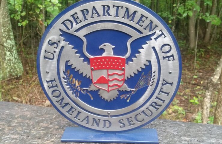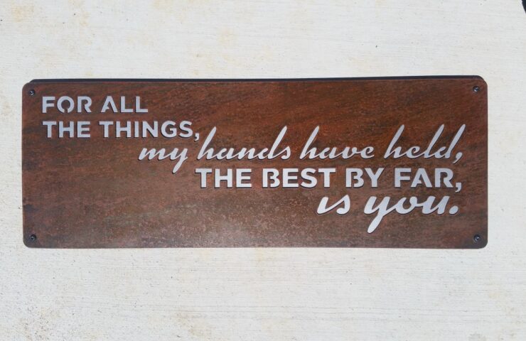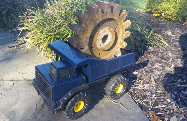

I was commissioned to build a corporate logo for a small business brewery. The signs are actually an inverse of each other. I was able to use the “scrap metal” letters to make the second logo. It turned out really well.
One of the logos is used when the company does beer festivals and gets mounted above their booth. I believe the other one is hanging in the brewery!
The finish on the product was raw- I sanded the slag off and that was it. It’s clean looking but still a very raw finish. I clearcoat the signs to prevent them from rusting.
